KANK-A
Branding, Animation, Ecommerce,
Advertising + Packaging
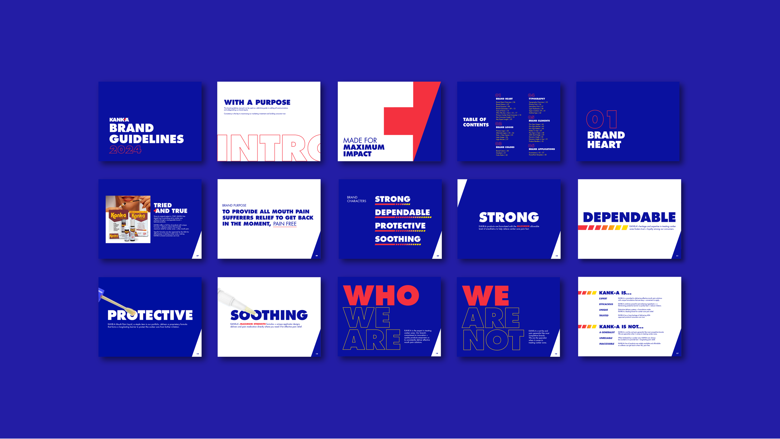
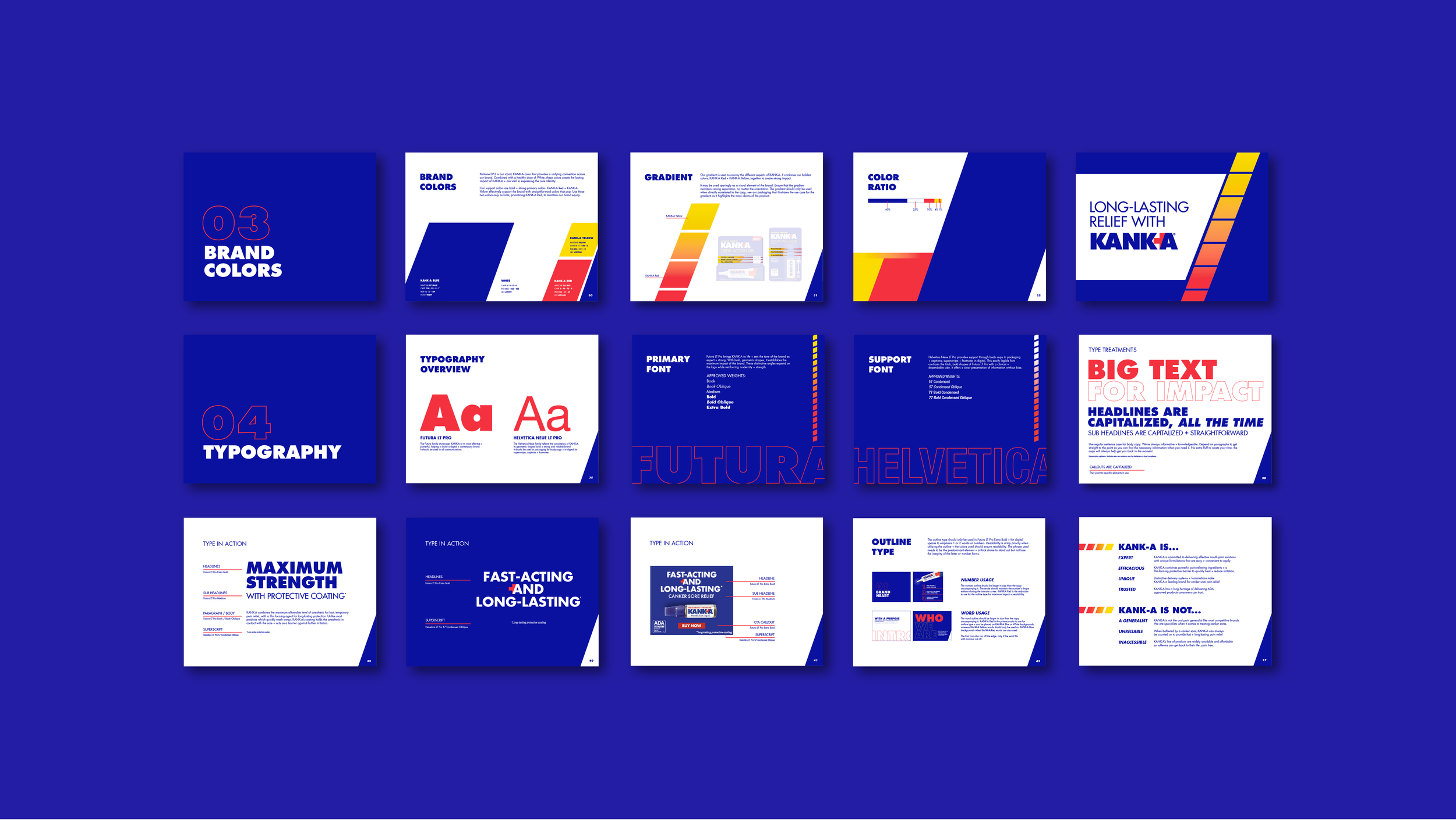
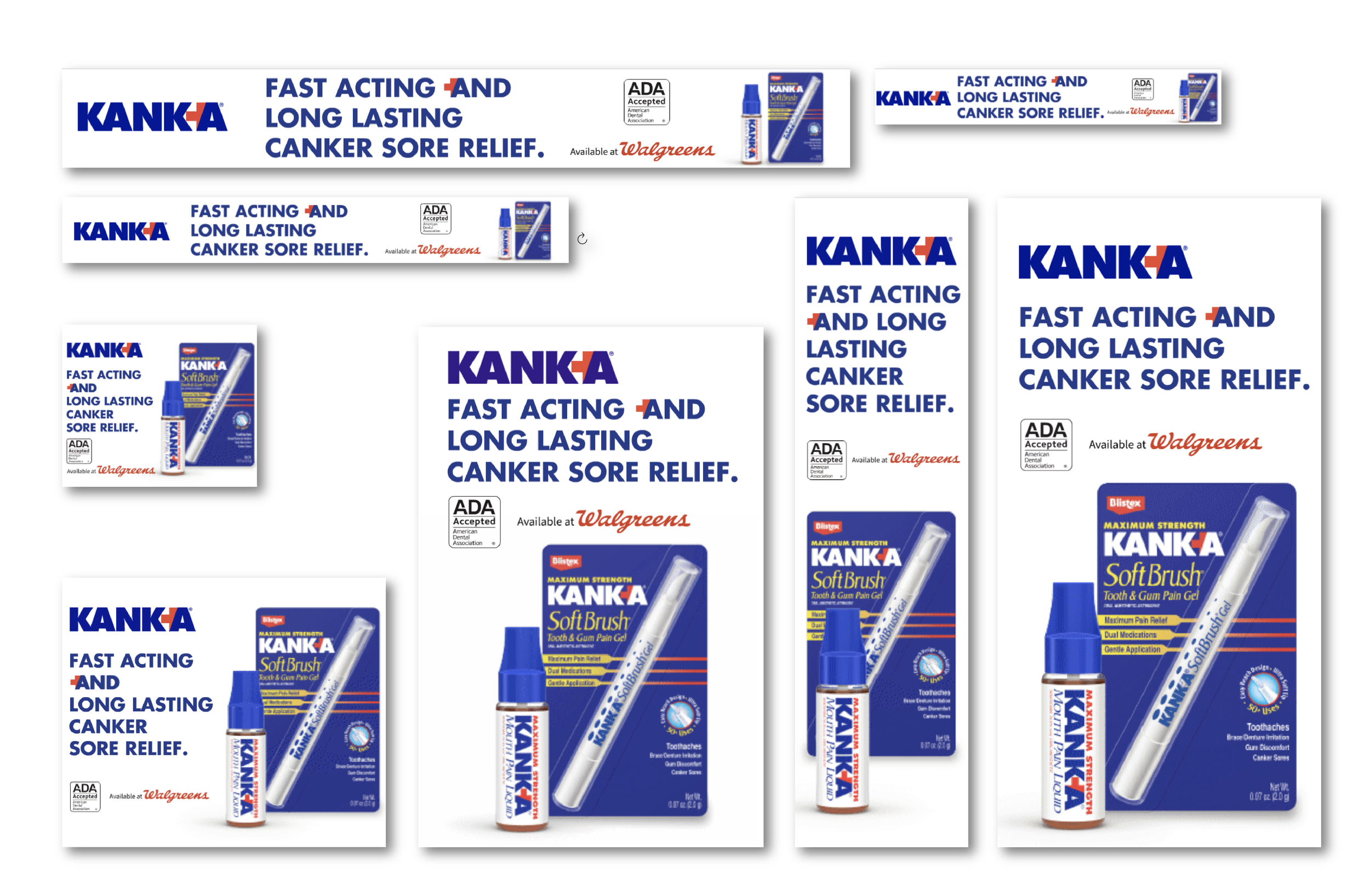
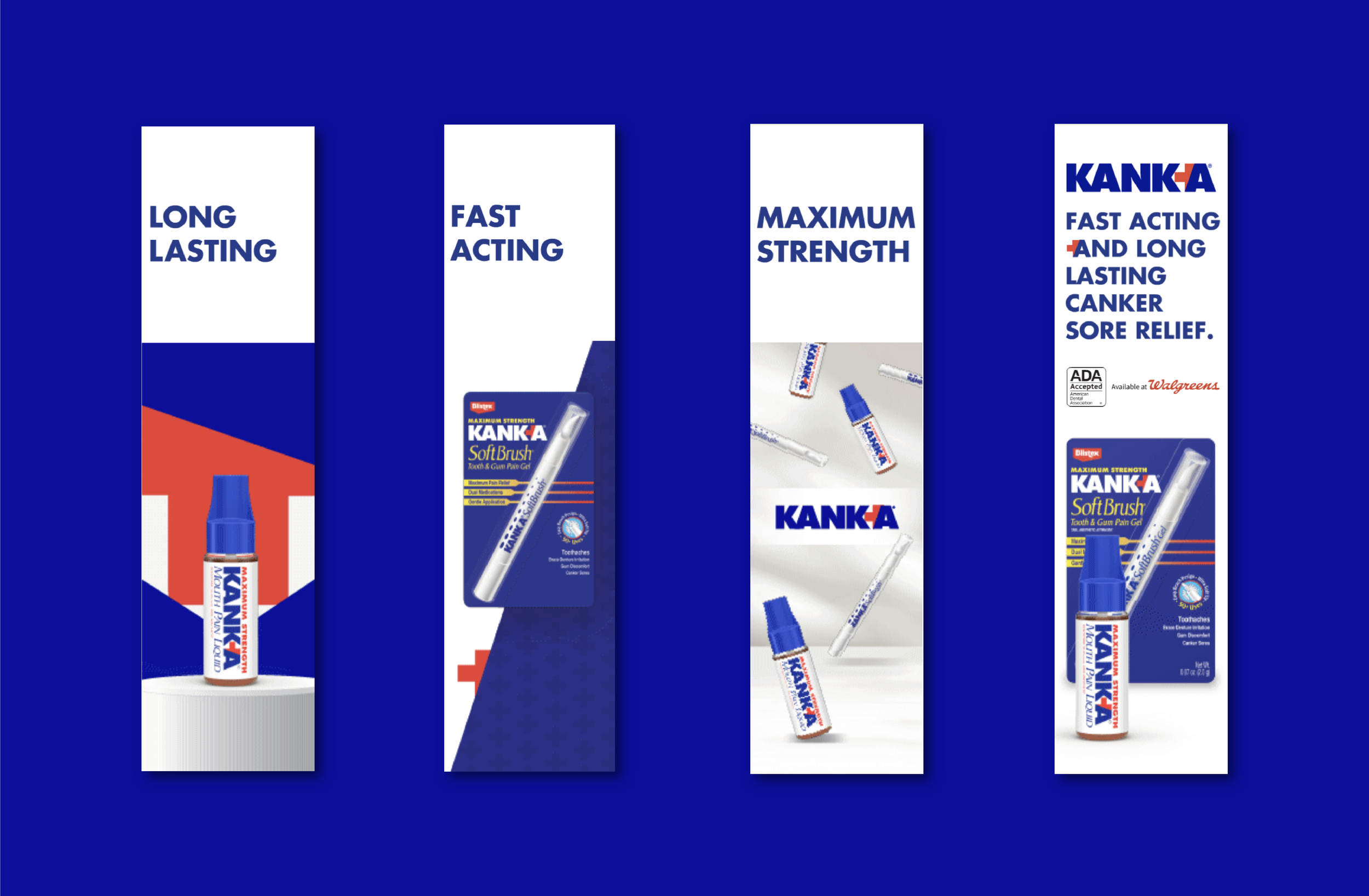
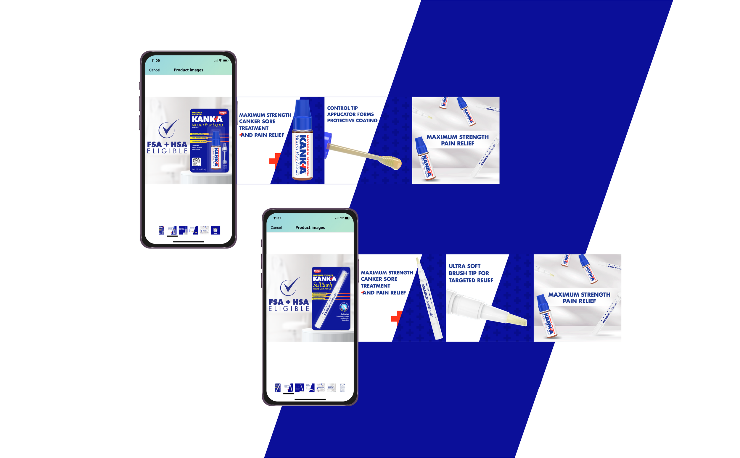
For over 70 years, KANK-A has stayed true to providing aid to mouth pain sufferers through a recongizable brand and dependable products. With bright, bold colors and a geometric, high-contrast logo, KANK-A aims to capitalize on their existing brand assets and expand them to bring pain free relief to new consumers both in store, with potential new products, and online retail spaces.
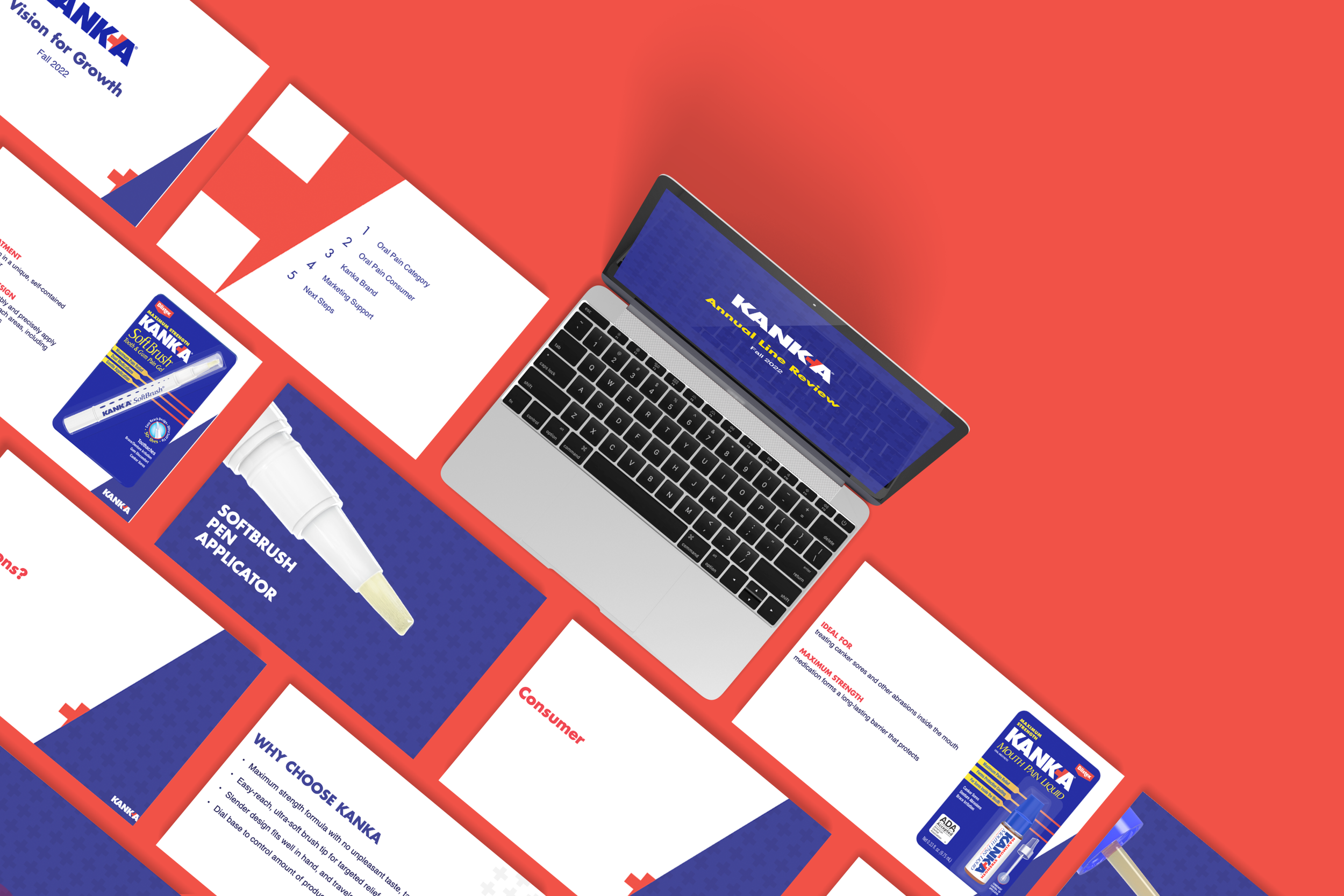
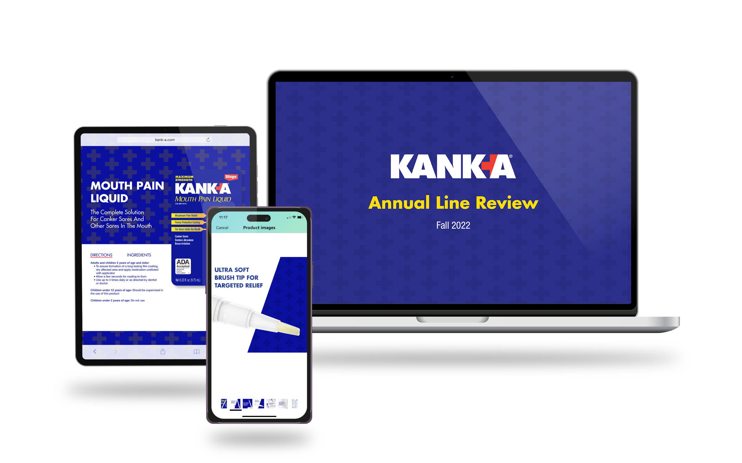
The objective for KANK-A is to evolve the brand into a digital space while reinvigorating its brand identity with modernity.
