TRIPLE ACTION GEL
Branding, Ecommerce,
Concepting + Packaging
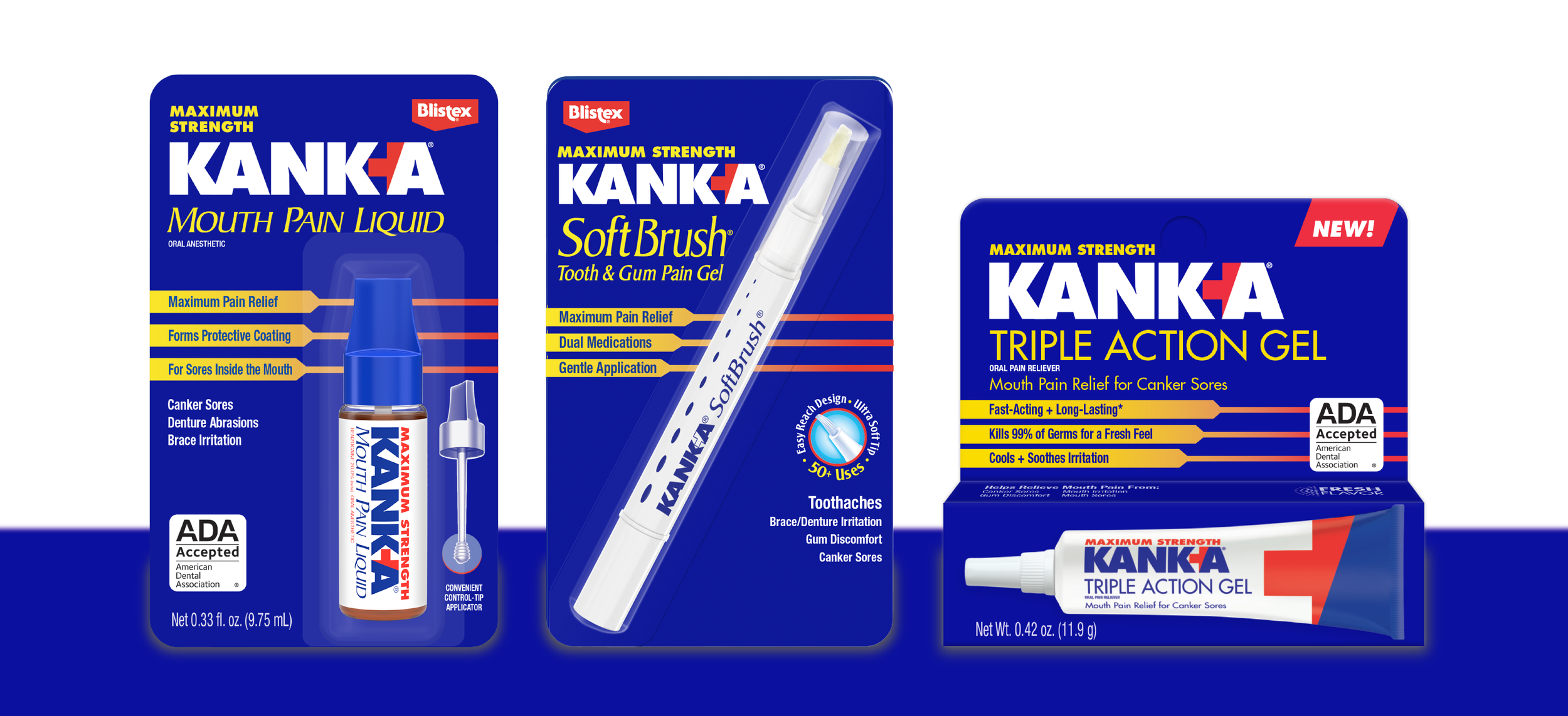
KANK-A newest challenge is expanding its portfolio to compete with the ever growing market on mouth pain relief. Standing out as the expert in canker sores, specifically, the project needs to reestablish that fact as #1 for consumers. Launching in 2025, Triple Action Gel will be a first for KANK-A in gel form so the packaging needs to highlight accessibility and subtle flavor.
The objective for KANK-A’s new product, Triple Action Gel, is to expand the brand portfolio with a new form while reinvigorating its brand identity with modernity but not isolating current consumers.
PROJECT OBJECTIVES
Maintain consistency for family
Clear, consistent, easy-to-read
Emphasis on FRESH FEEL flavor
Trustworthy, effective look
THE PACKAGING
•
THE PACKAGING •
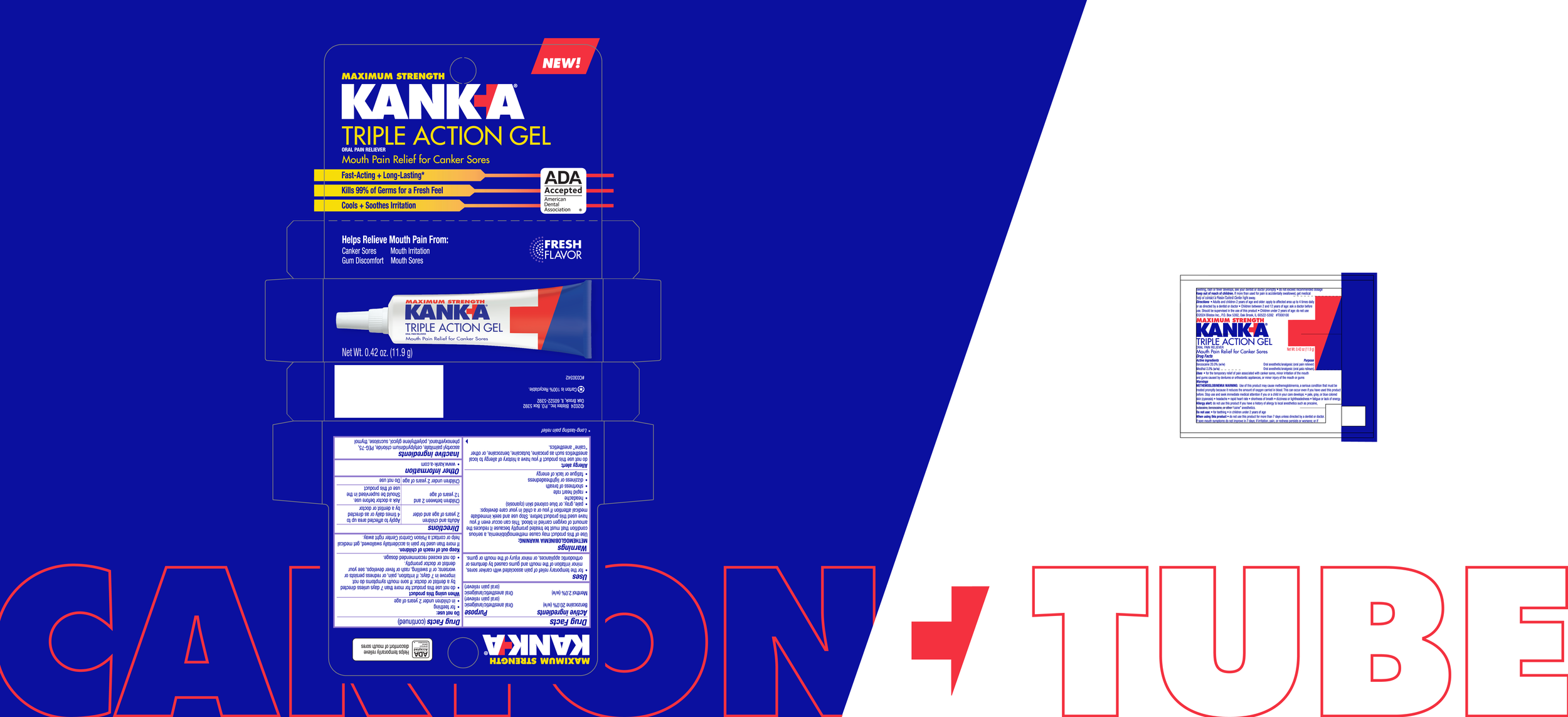
It all starts with a dieline…
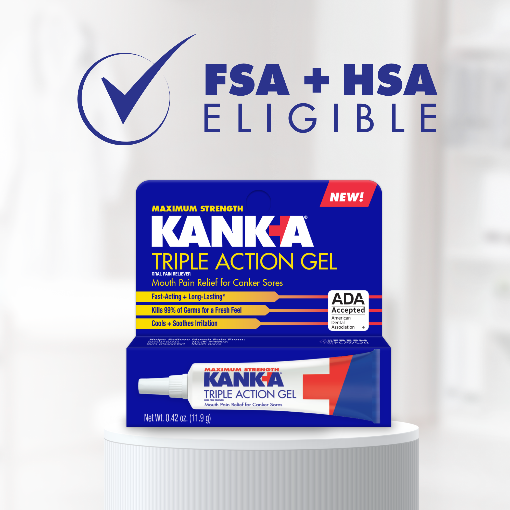
A multipanel carton proved difficult to encapsulate the existing brand identity onto a much smaller surface area. By dividing the claims and copy into sections, the hierarchy could be quickly established.
The tube, however, kickstarted ideas on fitting the Drug Facts intact without compromising some elements of design, and a strong desire to have KANK-A stand out as a premium product.
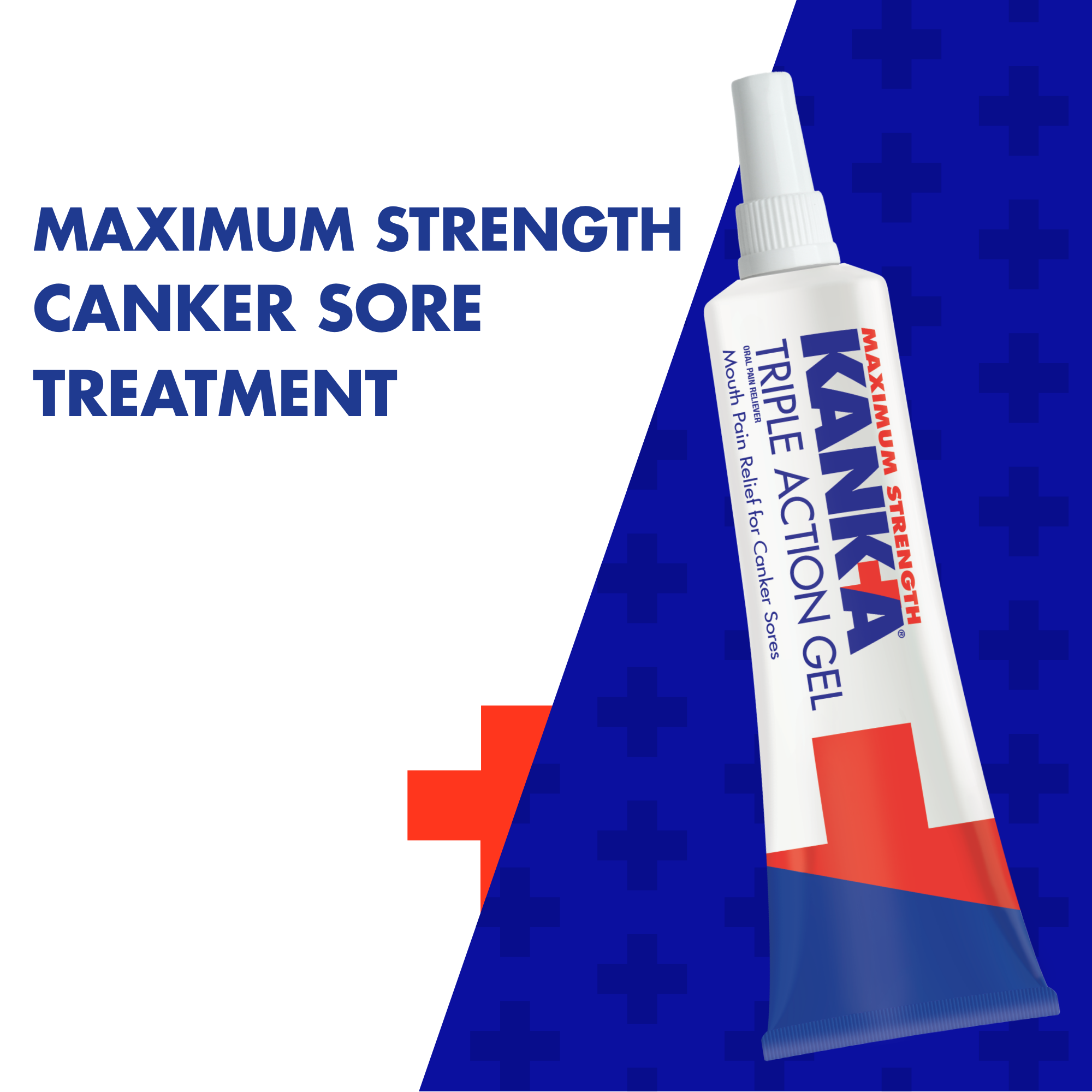
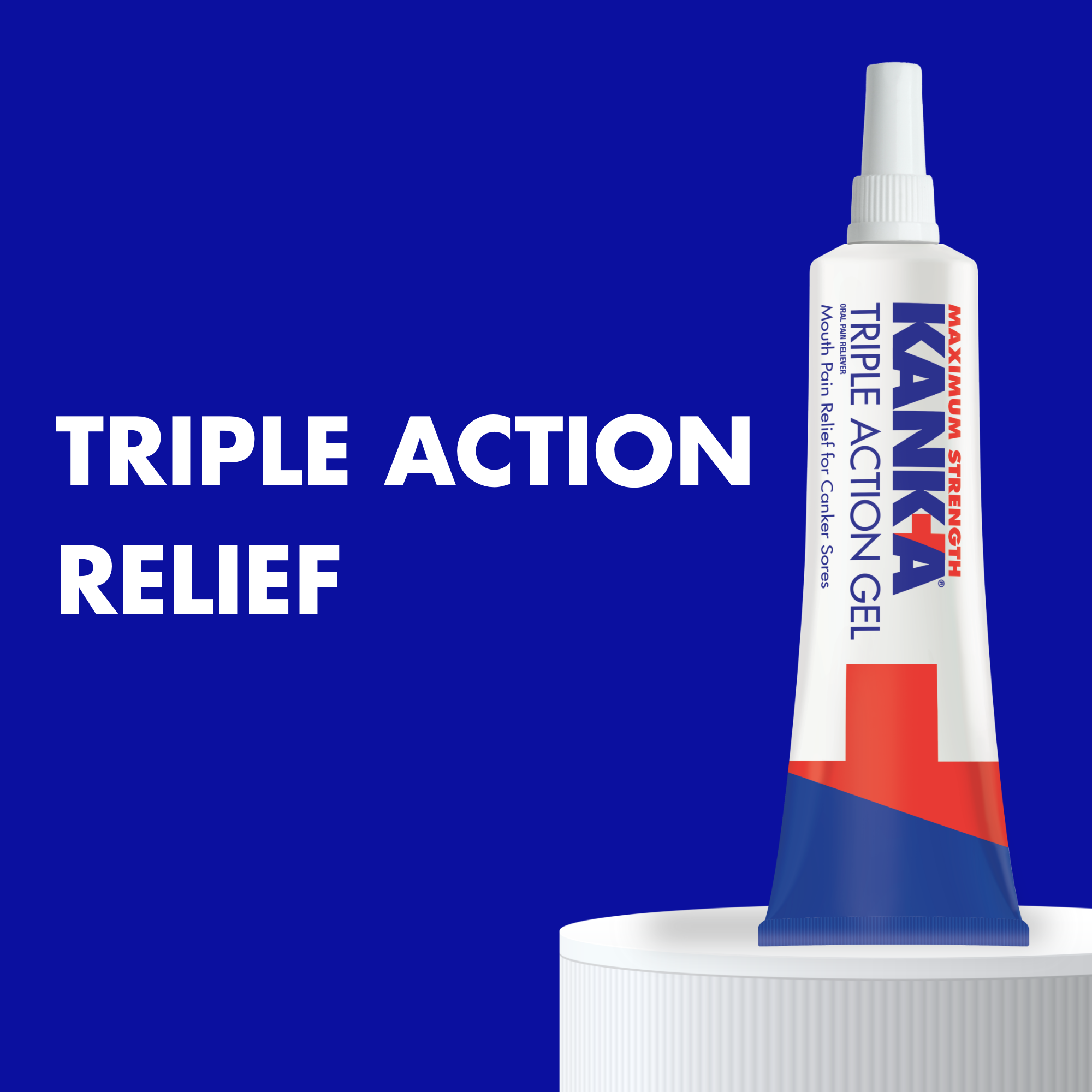
A full blue end of the tube, interrupted by the red Plug sign, created dramatic impact on an otherwise very white tube.
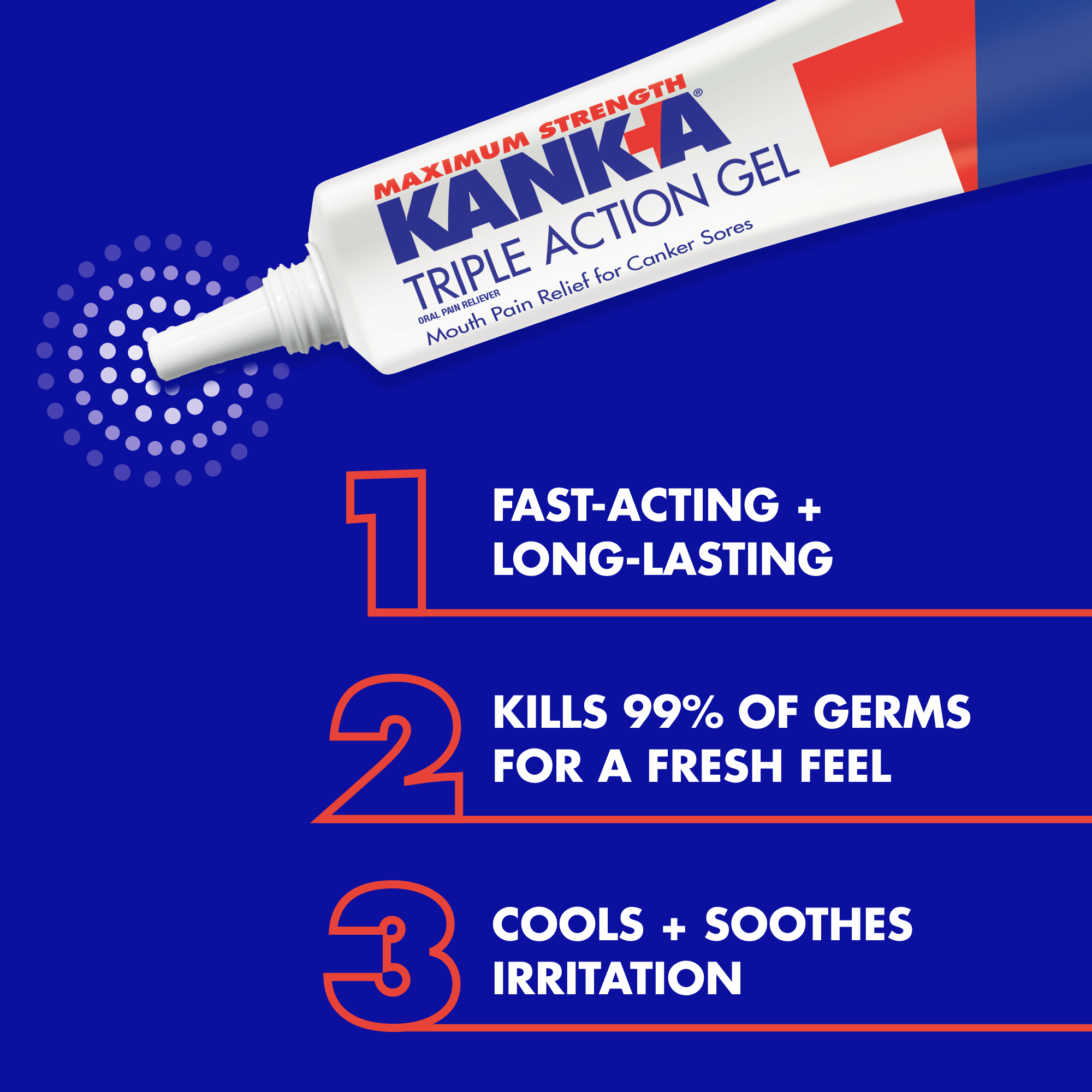
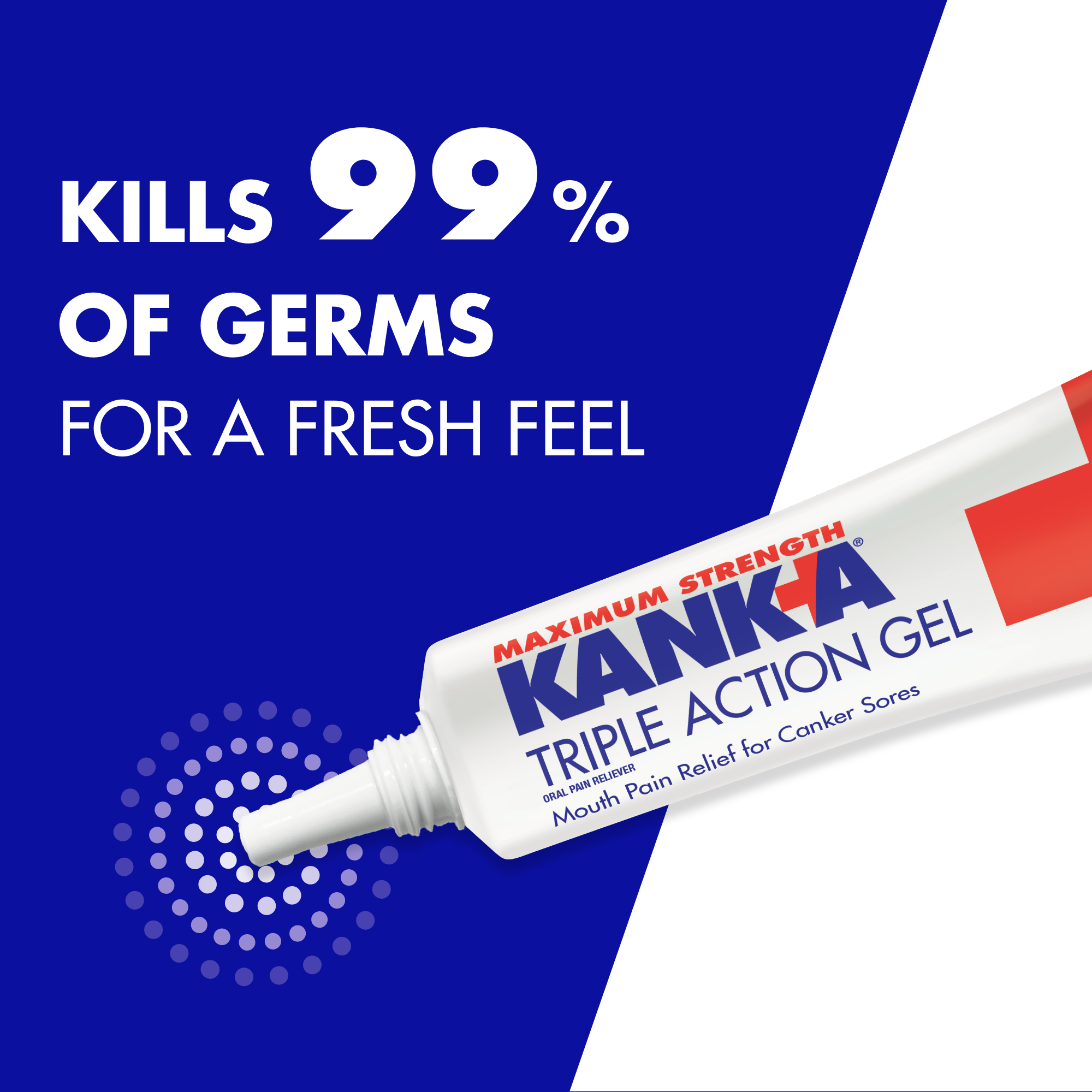
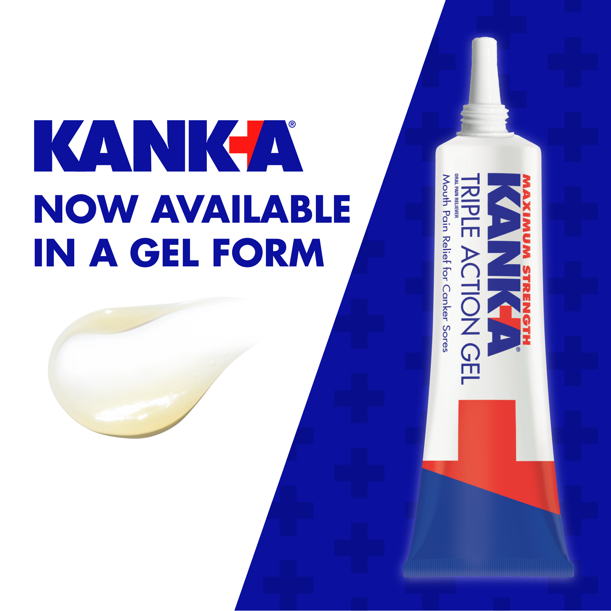
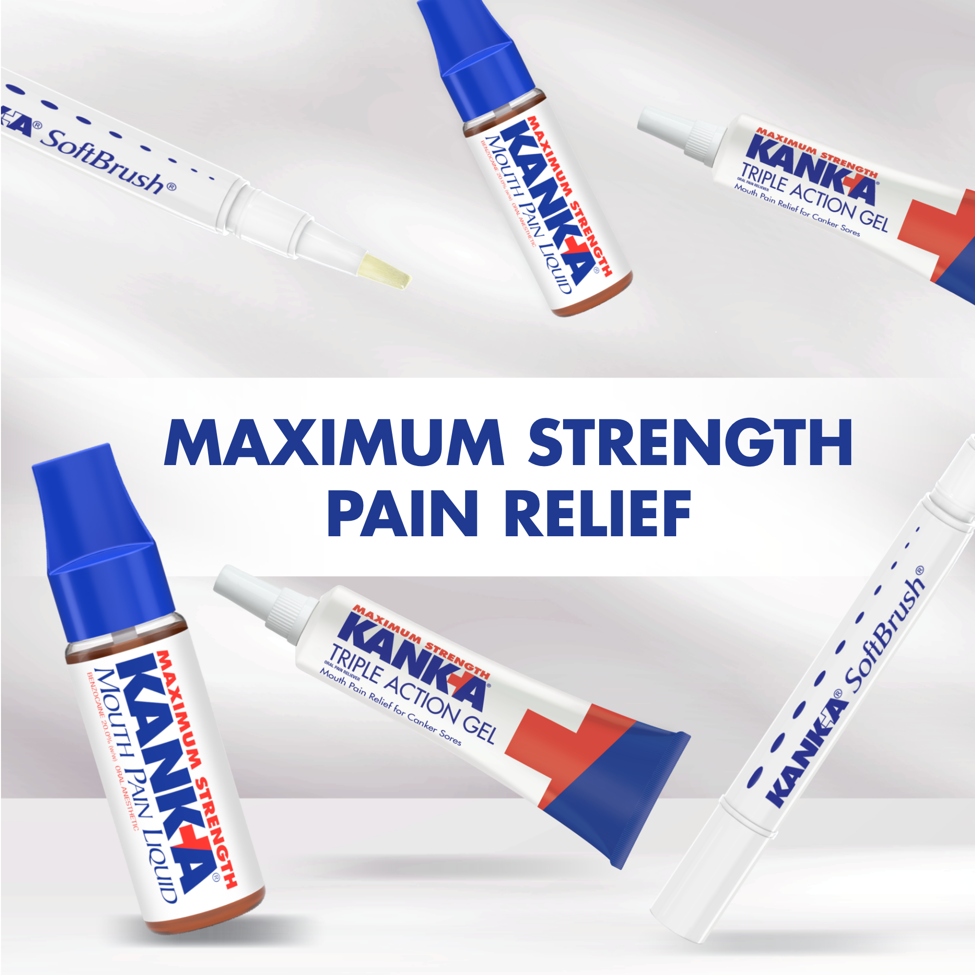
Ecommerce is where Triple Action Gel shines.
Creativity and movement were essential to generate excitement surrounding the new product, while effectively modernizing ecommerce for the brand as a whole. Bold outline numbers, straight forward all caps type, and the ever present KANK-A Blue develop high impact images.

